Send a payment
This is a typical user journey for sending a payment with UMA. The screens should house only the necessary information at a given step. Using progressive disclosure like this helps find a balance between simplicity and transparency.
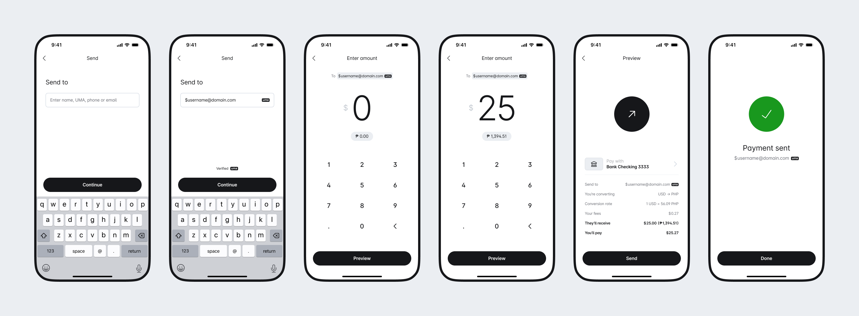
Make it clear the types of addresses that a user can input into the address field
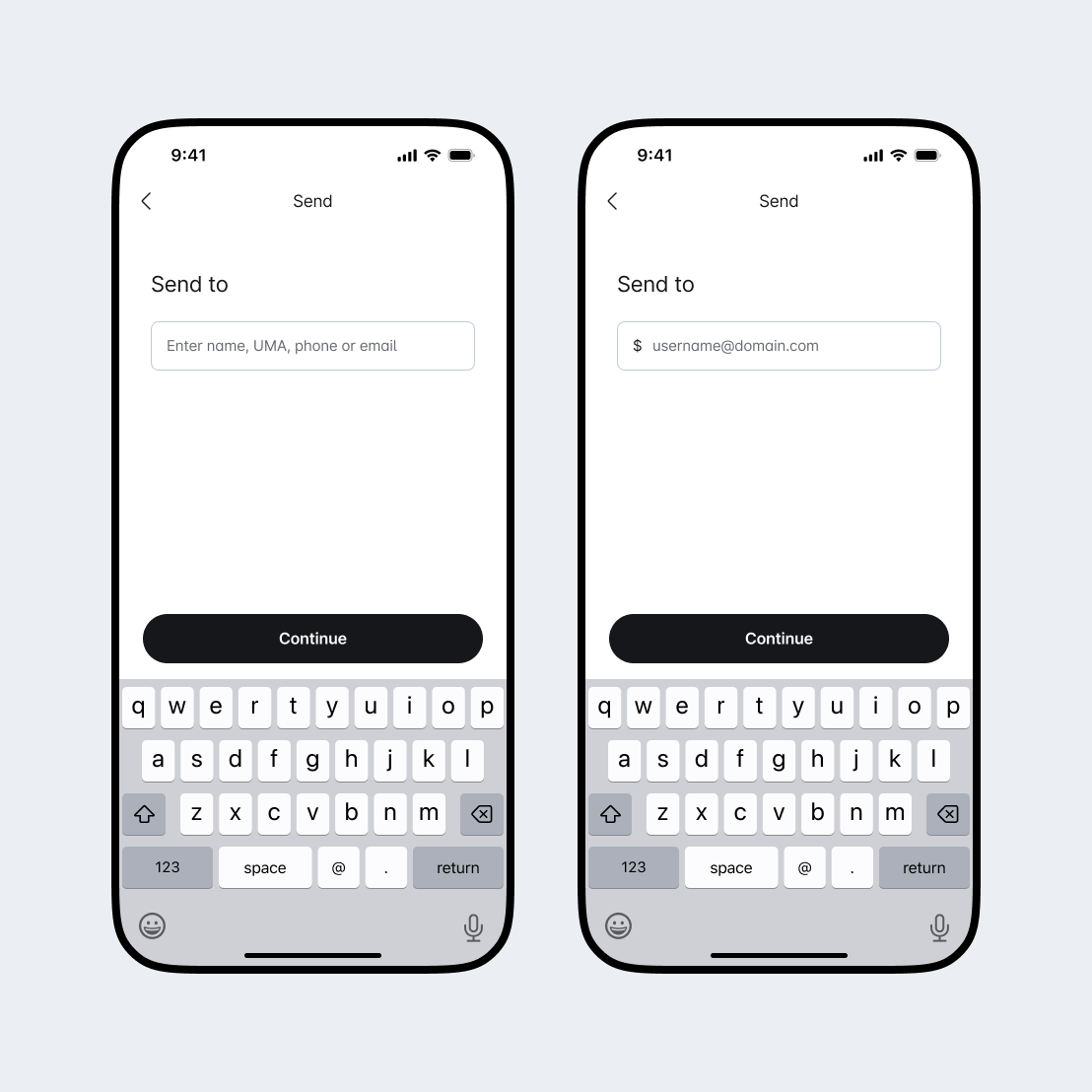
UMA can seamlessly live alongside other types of addresses, like a wallet address, phone number, email, or contact. Use this input to support multiple formats. Placeholder text is an ideal place to show a user you support UMA.
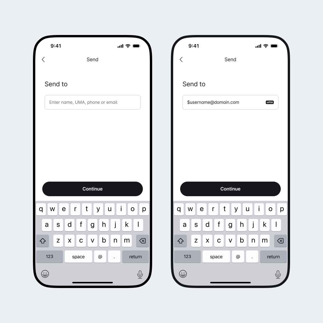
Use this input when your implementation only supports the UMA format. All UMAs begin with a '$' symbol. Consider pre-fixing the '$' symbol built into the input field by default to reduce typing friction.
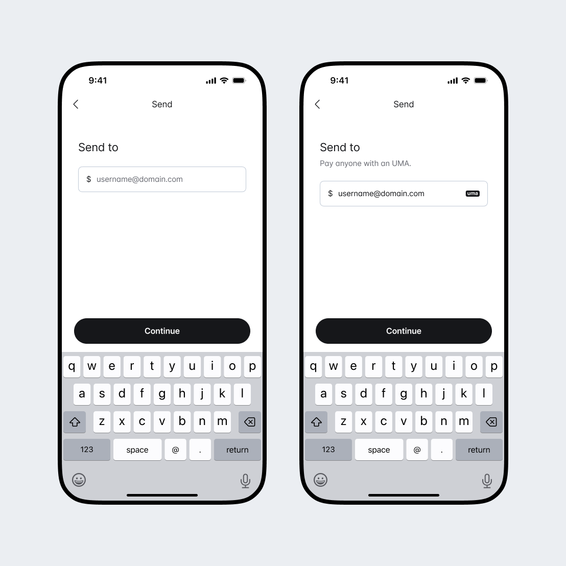
Reassure users they have entered a valid UMA.
Use the UMA logo as a trust cue.
Place the validation feedback in the context of the input field or closely tied to the call to action.
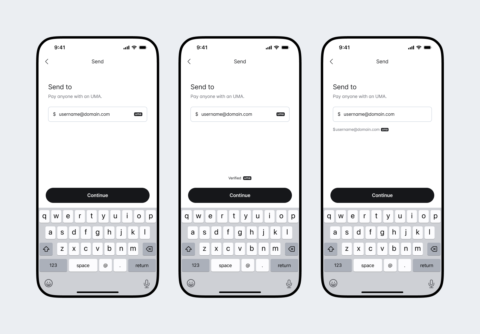
Consider simple single words like "Continue", or "Next" for the primary action when stepping through the payment flow
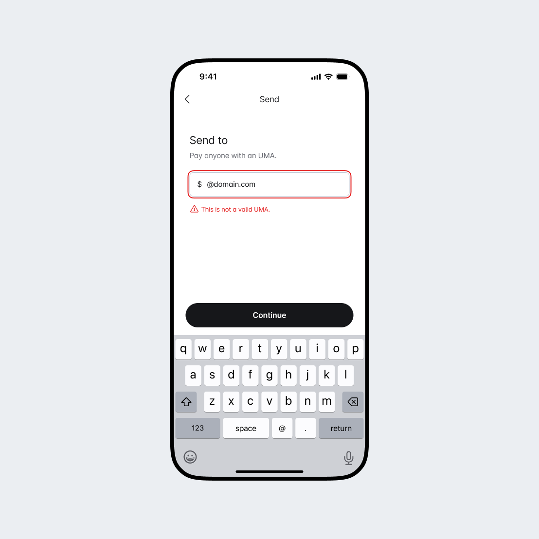
Communicate if an UMA has been incorrectly entered after the validation process to help a user fix the mistake.
Users input the amount they want to send to someone in their own currency by default, but can also choose to send a specific amount in the receiver's currency. Consider the best way to reduce friction for your users depending on how the will interact with this step.
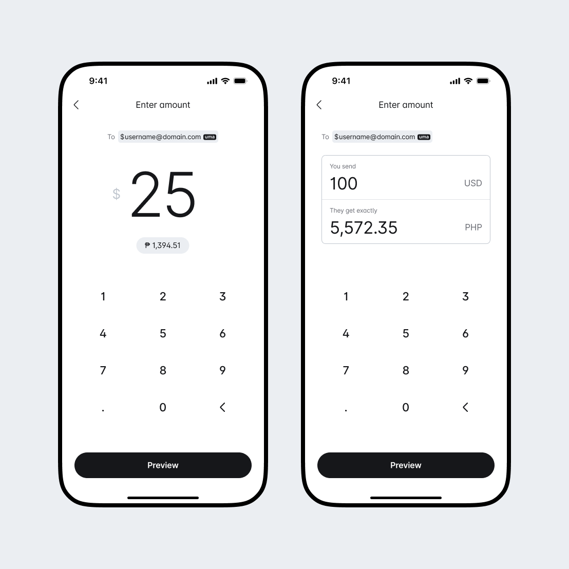
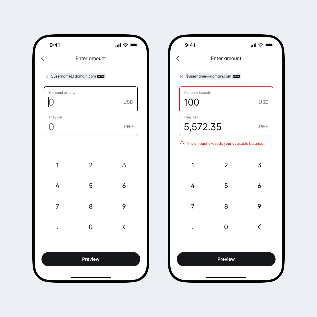
Give users the ability to enter an amount.
Show an estimated conversion amount of the receiver's default currency.
Provide a way for a user to switch between currencies to enter an amount.
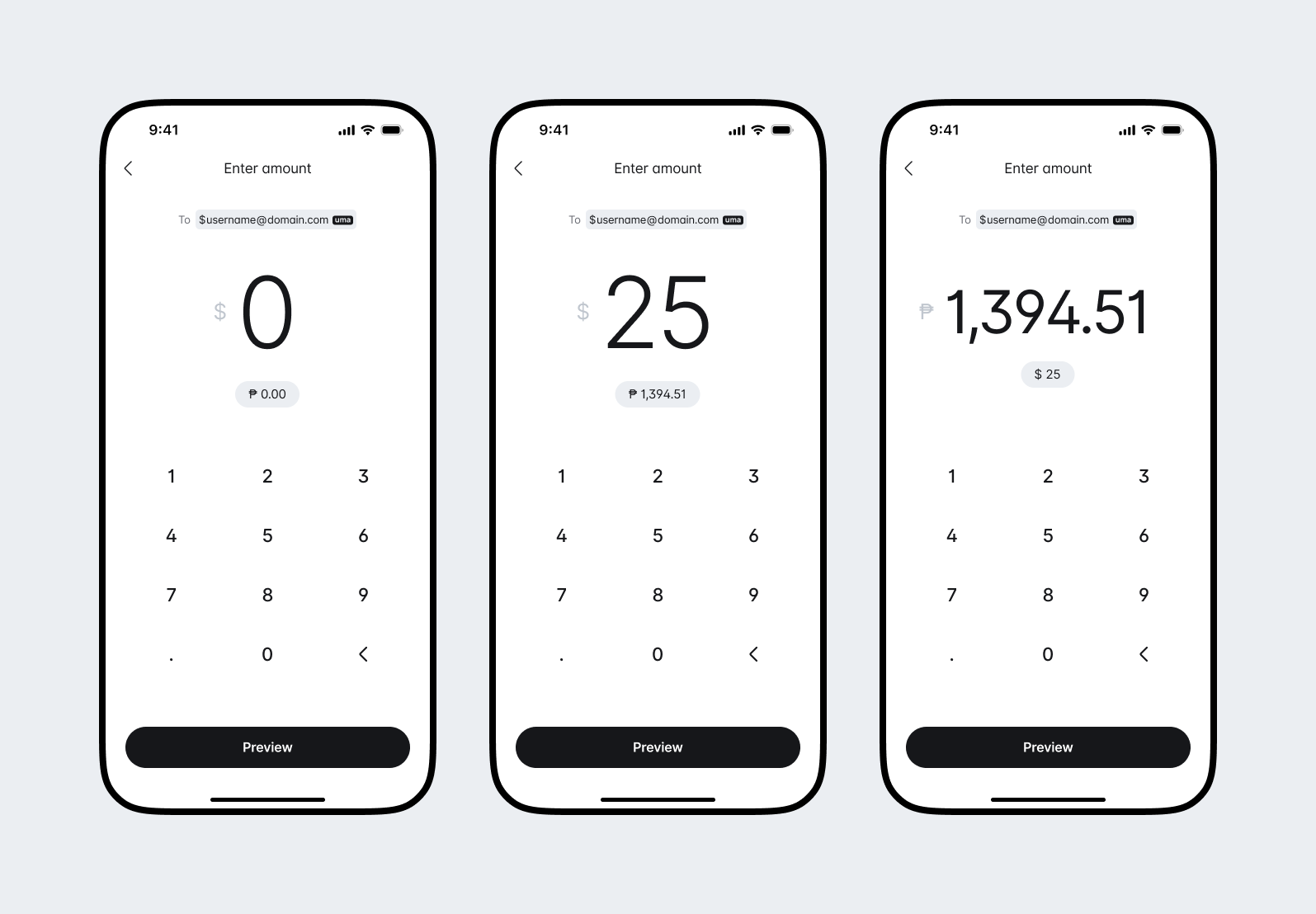
Give users the ability to enter an amount in either currency.
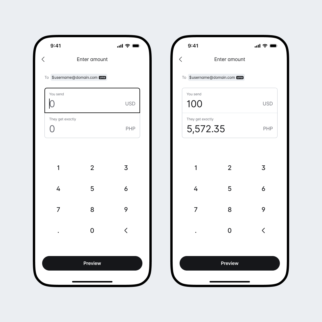
The receiving amount is locked. Use language like "They get exactly" to show the locked currency. Say "You send" to show the changing currency.
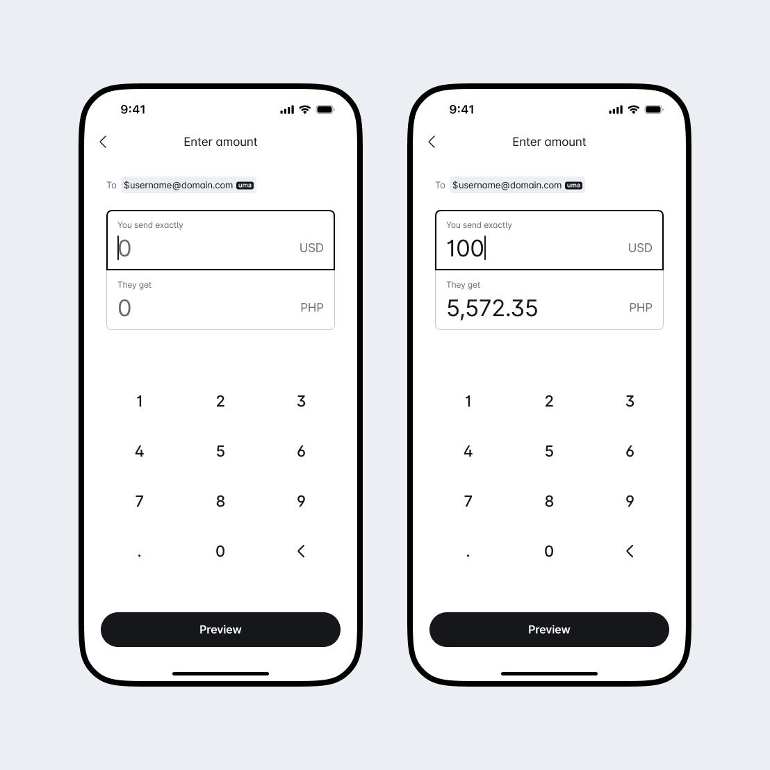
The locked amount defaults to whatever the user enters. Use language like "You send exactly" or "They get exactly" to show the locked currency, and "You send" or "they get" to show the changing currency.
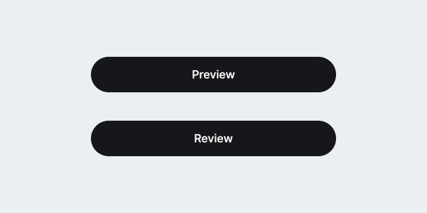
When users are about to move to the next step, use clear calls to action like "Preview" or "Review" to let them know what to expect next.
Use clear indicators and messaging when handling errors such as insufficient balance.
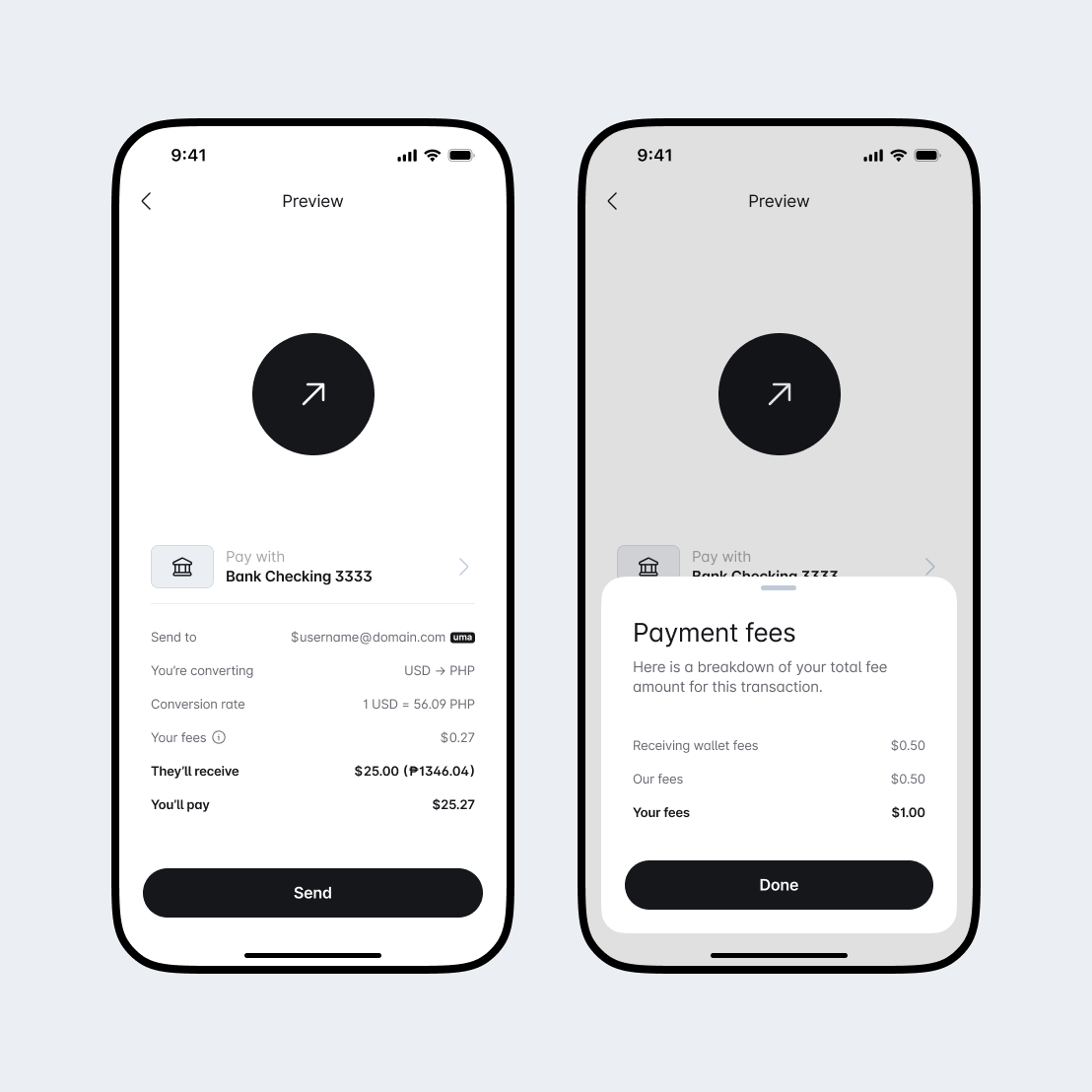
- Communicate transparently and accurately the user's commitment by completing the transaction, including any associated fees.
- Emphasize the amount the receiver will get and the amount the sender will pay.
- When exchanging currencies, clearly state the two currencies being exchanged and the associated exchange rate.
- Use a default funding source and provide a way for the user to select a different one if they choose.
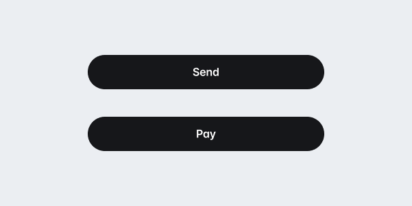
Use words like "Send", or "Pay" to clearly explain the action the user is taking and what to expect next.

If your business has a complicated fee structure, list out each cost in a clear way. This will help users see where the total amount comes from.
Assure users their action has been successful with clear messaging and visual cues.
Use a word like "done" to clearly communicate that this transaction is complete.
